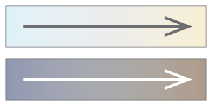
Color Temperature: Warm and Cool Colors
Why do we perceive colors to be warm or cool?
Because of the relative color differences that we see in sunlight and shade.
Disclaimer: I am an amateur, not an expert. My theory of color temperature is based on my own observations and my reading about color theory.
Lightness, hue, and chroma


Definitions of lightness, hue, and chroma. Every color can be described by three attributes:
- Lightness (also called value) is a measure of lightness versus darkness. White is the lightest color, and black is the darkest color.
- Hue is a color's position on a color circle or linear spectrum. Red, orange, yellow, green, blue, and violet are hues.
- Chroma is a measure of color intensity or vividness versus neutrality. Gray, white, and black are neutral.
For example, a dark brown color has these attributes: low lightness, orange hue, and medium chroma.
For more about my use of the terms lightness, hue, and chroma, see color spaces below.
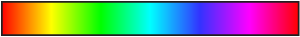
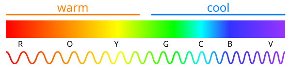
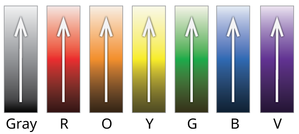
Color abbreviations. R=red, O=orange, Y=yellow, G=green, C=cyan, B=blue, V=violet, P=purple, M=magenta, K=black, W=white.
Warm and cool colors for beginners
Beginner's definition of warm and cool colors. Children are often taught this simplistic rule:
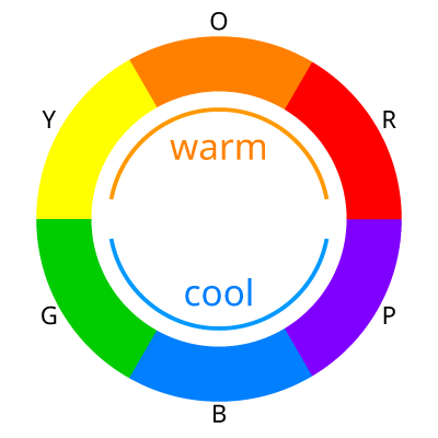
- Red, orange, and yellow are warm colors. Green, blue, and purple are cool colors.
This beginners' definition has a grain of truth, but it is overly simplified in two ways: it is limited to hue rather than including lightness, and it is absolute rather than relative.
Better beginner's definition of warmer and cooler colors. A more correct beginners' definition of warmer and cooler colors has two parts:
- Lighter colors are warmer. Darker colors are cooler. (Look at sunlight and shade.)
- Red, orange, and yellow are warmer. Violet, blue, and green are cooler.
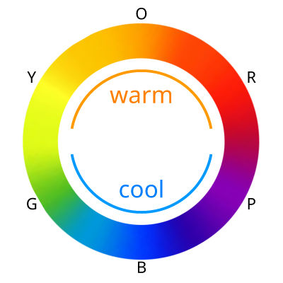
Warmer and cooler colors: It's all relative!

Color temperature is relative. Artists, especially painters, understand that warm and cool are relative terms, not absolute terms. Any particular color may appear to be warmer or cooler depending on how it compares to the other colors in the scene. Artists often use the words "warm" and "cool" to mean "warmer" and "cooler". Artists talk about warm greens and cool greens, warm reds and cool reds, warm yellows and cool yellows, and warm whites and cool whites. The phrase "a warm green" means "a green that is warmer than medium green". A green-yellow color may be described as a "warm green" or a "cool yellow".
Color temperature involves lightness, hue, and chroma. Colors may appear to be relatively warmer or cooler than other colors depending on differences in their lightness, hue, and/or chroma. Here is my summary of the effects, as I see them:
Color temperature effects of lightness, hue, and chroma.
- Relative-lightness effect. Lighter colors are warmer. Darker colors are cooler. (Look at sunlight and shade.)
- Relative-hue effect. Hues nearer to the orange hues (yellow-orange to red-orange) are warmer. Hues nearer to the blue hues (green-blue to violet-blue) are cooler.
- Relative-chroma effect. For colors with orange hues (yellow-orange to red-orange), lower chroma is cooler. For colors with blue hues (green-blue to violet-blue), lower chroma is warmer.
I will describe these effects in more detail below.
Color temperature, depth, and mood. Artists use the words "warm" and "cool" to talk about three very different perceived effects. Color temperature: Warmer and cooler colors are associated with warmer and cooler thermal temperatures. Depth: Warmer colors are said to advance, and cooler colors are said to recede. Mood: Warmer colors are said to be active, and cooler colors are said to be passive. All three effects are relative, not absolute. I examine only color temperature, not depth or mood.
Real-world viewing context. I examine color temperature in the context of how we view the real world, in both natural and built environments. I also examine realistic representational images, such as photos, and realistic artworks with colors based on careful observation of the real world. I avoid representational artworks with fanciful colors and non-representational (abstract) images. For example, to decide whether yellow-green looks warmer than blue-green, I prefer to look at the colors of the leaves on a real tree, or in a photo or a tree, or in a realistic painting of a tree by an observant artist, rather than looking at a painting of an imaginary tree, or comparing two abstract color swatches.
Illumination: Sunlight and skylight
Illumination. Artists keenly observe light and shade. Artists study the interplay between the colors of objects and the colors of light sources. If you look carefully at an object of a single uniform object color, such as a white egg, you will see that different parts of the object appear to have different colors — different lightness, hue, and chroma — due to multiple sources of illumination coming from different directions.
I think that our perception of warmer and cooler colors stems primarily from our experience of viewing objects outdoors in warm sunlight and cool shade. So, I will start by examining daylight — specifically, the brightness, hue, and direction of sunlight and skylight.
Definitions of sunlight, skylight, and daylight. I use the word sunlight to mean only the direct light from the sun, not counting other light from the sky. I use the word skylight to mean the light from both clear sky and clouds, not counting the direct light from the sun. I use the word daylight to mean all the light from both the sun and sky. The corresponding adjectives are sunlit, skylit, and daylit.
Dominance of sunlight over skylight. On a clear day, the sun is brighter than the entire blue sky. If you look at your shadow on the ground, you can see that the daylit (sunlit and skylit) ground is more than twice as bright as the shadowed (skylit and not sunlit) ground. So, although the sunlit parts of objects are lit by both sunlight and skylight, they are lit more by sunlight than skylight. See the sunlight-versus-skylight experiment below.
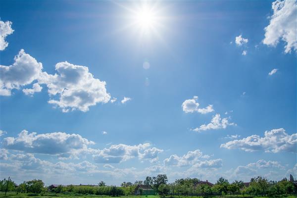
Hues of sunlight and skylight. Typically, in the daytime, when the sky is clear or partly cloudy (not overcast), the sky looks blue or cyan (green-blue) overhead, becoming lighter (whiter) near the horizon. Even at sunrise and sunset, the clear sky overhead is typically mostly blue. The sun looks yellow-white (nearly white) when high in the sky (and not hidden by clouds), becoming more yellow-orange or orange when low in the sky. (Warning: Do not stare at the sun!) Overall, when it is not overcast, sunlight is relatively more yellow or orange, and skylight is relatively more blue or cyan. (Note: Even if you personally perceive the high sun to be white, not yellow-white, it is still relatively more yellow or orange than blue skylight.) The sky is blue because of atmospheric scattering (see below). Clouds typically look white or gray (neutral colors). At sunrise and sunset, for a short time, the sky near the sun has an orange glow, and some of the clouds may be brilliant orange or pink.
[Danijela 2704, Shutterstock.com]

[Yuriy Kulik, Shutterstock.com]
Directions of sunlight and skylight. When the sun is shining (not hidden by clouds), direct sunlight illuminates objects from one direction, whereas skylight illuminates objects from many directions. The sunlit parts of objects are lit primarily by sunlight, and secondarily by skylight. The shaded parts of objects outdoors are lit primarily by skylight, and secondarily by reflected light.
Observing the illumination of objects in sunlight and shade.

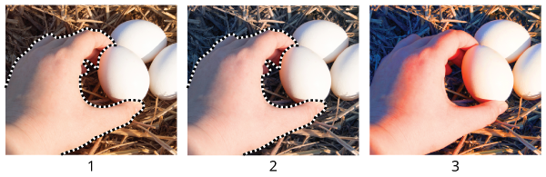
[Syrtseva Tatiana, Shutterstock.com]
Exaggerated warm-cool hue differences.
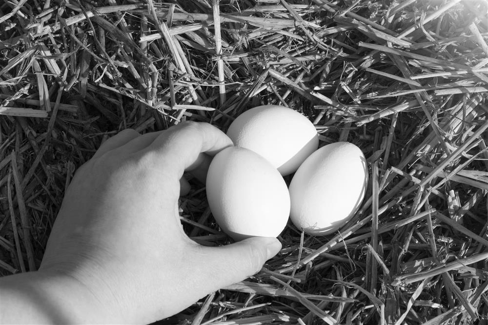
Examine the photo of the eggs in sunlight (above) and the exaggerated-color version. Notice that the warmer sunlit sides of the eggs are lighter than the cooler shaded sides, and the warmer sunlit side of the hand is lighter than the shaded side. Notice that the shaded sides of two eggs are relatively more blue than the sunlit sides — these shaded sides are illuminated primarily by blue skylight. The shaded side of the third egg is relatively more pink or orange — this shaded side is illuminated primarily by pink or orange light reflected from the hand. Notice that the sunlit part of the hand is relatively more pink or orange, and the shaded side of the hand is relatively more blue (in other words, more gray-orange or lower chroma, see the relative-chroma effect below).
Why is the sky blue and the sun yellow-white?
To understand color temperature, you can simply observe that the sky is blue, and the sun is yellow-white. You do not need to know why the sky and sun have these colors, but here is the reason:
Why is the sky blue and the sun yellow-white? The sky is blue due to atmospheric scattering. The atmosphere scatters shorter wavelengths of light (violet, blue, and cyan) more than longer wavelengths of light (red, orange, and yellow). Above the atmosphere the sunlight looks white (S1 in the diagram). For example, a white spacecraft looks pure white in direct sunlight in space. As the sunlight goes through the atmosphere, the sky is filled with scattered light, which has relatively more violet, blue, and cyan and relatively less red, orange, and yellow (S2). The skylight, not including the direct sunlight, looks blue or cyan. The direct sunlight that reaches the ground is missing the scattered light, so the direct sunlight has relatively less violet, blue, and cyan, and relatively more red, orange, and yellow (S3). The direct sunlight, not including the skylight, looks yellow-white (nearly white) when the sun is high in the sky. The direct sunlight looks more yellow-orange or orange when the sun is low in the sky, because, at a low angle, the light travels through more atmosphere and there is more scattering. (Warning: Do not stare at the sun!) The clouds in the sky typically look white or gray (neutral colors) because they diffuse all the light that hits them.
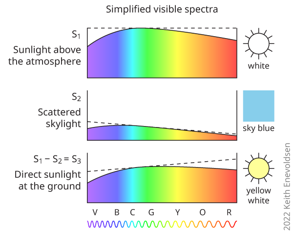
Note: The perceived color is based on the entire visible spectrum, not just the peak of the graph. The peak of the sunlight spectrum is green, but sunlight is not green.
Illumination: Reflected, transmitted, and artificial light
Sources of illumination other than sunlight and skylight are listed below. When observing outdoors in sunlight, as I recommend below, these other sources are less significant than sunlight and skylight.
Reflected light. An object may be partly illuminated by light reflected from other objects. The reflecting objects may be large, such as green trees, a green lawn, a yellow field, brown earth, blue water, or a red brick wall. The reflecting objects may be small and very near, such as the hand holding the egg in the photo above.
Transmitted light. An object may be partly illuminated by light transmitted through translucent objects, such as tree leaves. The major source of transmitted light outdoors would be translucent clouds, but I am counting the light from clouds as part of skylight. Not counting clouds, the most common type of transmitted light outdoors must be daylight coming through translucent tree leaves (usually green, but sometimes yellow, orange, or red). Note that tree leaves both reflect and transmit. Under a forest canopy, the blue skylight may be replaced by the green glow of the canopy.
Dominance of sunlight and skylight over reflected and transmitted light. On the sunlit parts of objects, sunlight clearly dominates over skylight, reflected light, and transmitted light. On the shaded parts of objects, skylight usually dominates over reflected and transmitted light because the sky is usually bigger and brighter than the other reflecting and transmitting objects. So, our perceptions of color temperature are influenced more by sunlight and skylight than by reflected or transmitted light, but reflected and transmitted light are not insignificant. Where the sky is mostly hidden, such as under a forest canopy, reflected and transmitted light may dominate over skylight. In open areas, there is usually more reflected light than transmitted light because there are more reflecting objects, such as ground, plants, and buildings, than transmitting objects, such as overhanging translucent tree leaves.
Artificial light. Artificial lighting is significant indoors, and outdoors at night, but not outdoors in daylight. Modern artificial lighting does not feel noticeably warm (at a distance), so it does not influence our mental association of color with thermal temperature. Old incandescent lighting was, like sunlight, warm in both thermal temperature and hue, so it reinforced the same mental association of color with thermal temperature that is engendered by sunlight.
Firelight. Today, for most people, firelight is not a major source of light compared to daylight and artificial light. In the past, fire was the only source of light and heat at night. Fire, like sunlight, is warm in both thermal temperature and hue, so it reinforces the same mental association of color with thermal temperature that is engendered by sunlight.
Moonlight. Moonlight is a significant source of light only at night, and it is not a source of heat, so it does not influence our mental association of color with thermal temperature.
Heat in sunlight and shade
Sunlight is warm, and shade is cool. Standing in the sunlight feels warmer than standing in the shade. The sunlit side of your hand feels warmer than the shaded side. A rock in the sunlight feels warmer to the touch than a rock in the shade. This felt experience influences our visual perceptions. When we look at things, even at a distance, we presume, based on experience, that the things in direct sunlight are warmer than the same things in the shade.

[CreativContent, Shutterstock.com]
Definitions of shade and shadow. I use the word shade to mean any place that is shielded from direct sunlight. This includes both the side of an object that faces away from the sun and the part of an object that is in the shadow of another object.
Definitions of thermal temperature and color temperature. I use the term thermal temperature to mean the actual warmth or coolness that you feel on your skin, as distinguished from the color temperature that you see with your eyes.
Observing the correlations of lightness and hue with thermal temperature
Why do we perceive some colors as warmer and other colors as cooler? First, why do we perceive lighter colors to be warmer than darker colors? Second, and more curiously, why do we perceive some hues (red, orange, and yellow) to be warmer than other hues (green, cyan, blue, and violet)? I think that we can answer these questions by carefully observing the relative color differences that we see in sunlight and shade.
A narrow explanation. A popular but incorrect explanation is that our mental association of color with thermal temperature stems from our observations of particular warm objects, such as orange fire, and particular cool objects, such as blue water. There are three problems with this kind of explanation. Problem 1: This kind of explanation is based on a small number of particular objects, and it omits all the other objects in our visual experience. We actually see warm and cool objects of all hues. Problem 2: This kind of explanation typically addresses only hue, and it ignores lightness. Lightness is actually more significant than hue. Problem 3: This kind of explanation is typically based on absolute hues rather than relative color differences.
A broad explanation. I think that the correct explanation is much broader than the narrow explanation above. I think that our mental association of color with thermal temperature stems primarily from our countless observations, every day when the sun is shining, of objects of all colors, as they appear in sunlight and shade. When we look at objects in sunlight, we see correlations between the relative color differences of the sunlit and shaded parts of the objects and their relative thermal temperature differences (see the relative-lightness correlation and the relative-hue correlation below). This explanation is much broader than the narrow explanation above because we see objects in sunlight much more often than we see fire, and we see objects in shade much more often than we see blue water.
Definitions of object color and perceived color. I use the term object color to mean the intrinsic color of an object. I use the term perceived color, or simply color, to mean the color that you see. For example, a bright red ball has a single object color (bright red), but you perceive the sunlit side to have a lighter color (bright red) than the shaded side (darker red).
Method of observation. We should start by carefully observing the colors we see in the real world. To determine which colors are relatively warmer or cooler, I will use the following controlled and constrained method of observation:
Controlled method of observing and comparing warmer and cooler colors.
- Observe outdoors in sunlight. Go outdoors when it is sunny or partly cloudy, but not overcast. Observe at a time when there is some direct sunlight illuminating and warming some objects or parts of objects, and some shade cooling some objects or parts of objects. (You can sometimes see the same effects when you are indoors and near large windows in direct sunlight.)
- Compare the sunlit and shaded parts of an object, or a group of similar objects, that has a single object color. Compare the perceived colors of the sunlit and shaded parts of an object that has a single object color, such as the sunlit and shaded parts of a concrete walkway, or the sunlit and shaded parts of a group of similar objects that has the single object color, such as the sunlit and shaded leaves in a cluster of similar trees.
- Compare the sunlit and shaded parts of an object simultaneously. Compare the perceived colors of the sunlit and shaded parts of an object only when you can see both parts at the same time, preferably adjacent to each other.
Reasons for using this controlled method of observation:
- Why observe outdoors in sunlight? We want to find the correlations between perceived color differences and real thermal temperature differences. To do this, we need to observe at a place and time when there are perceptible differences in illumination and color that are correlated with tangible differences in thermal temperature. This place-and-time is outdoors in sunlight. It is not effective to observe outdoors on overcast days because the light is almost uniform, the thermal temperatures are more uniform, and the thermal temperature differences are correlated with factors other than illumination and color, such as wind, rain, or snow. It is also not effective to observe indoors with indoor lighting because the thermal temperatures are more uniform, and the thermal temperature differences are correlated with factors other than illumination and color, such as ventilation, heating, or air conditioning.
- Why compare the sunlit and shaded parts of an object, or a group of similar objects, that has a single object color? We want to find the correlations between perceived color differences and real thermal temperature differences. To do this in the most controlled way, you need to compare things that are nearly identical, except for their differences in perceived color and their differences in thermal temperature. Comparing different kinds of objects that have different object colors, such as comparing the color of a green tree in the foreground to the color of the distant blue mountains, will have too many confounding variables. In this case, the perceived color differences may be related to differences in the kinds of objects, differences in the object colors, or differences in distance, rather than differences in thermal temperature.
- Why compare the sunlit and shaded parts of an object simultaneously? We want to compare slight and subtle color differences. You can reliably observe these slight differences only if you are comparing the two colors under the same viewing conditions. It would be unreliable to compare two colors that you see at different times because the viewing conditions will have changed. Furthermore, you would be comparing a currently perceived color to the memory of a previously perceived color. For example, it would be unreliable to (1) compare a color you see when the sun is shining with a color you saw a few minutes ago when the sun was behind the clouds, or (2) compare a color you see in the evening with a color you saw at midday, or (3) compare a color you see this summer to a color you saw last winter.
Observed correlations. When I observe the colors of objects outdoors in sunlight, using the observation method described above, I see two broad correlations between the relative colors of objects and their relative thermal temperatures: the obvious relative-lightness correlation and the subtle relative-hue correlation.
Relative-lightness correlation. When we compare the sunlit and shaded parts of an object, we observe: The sunlit parts are usually both warmer in thermal temperature and lighter in color. The shaded parts are usually both cooler in thermal temperature and darker in color.
The relative-lightness correlation is obvious. We all know that sunlight is brighter and warmer than shade. We see the relative-lightness correlation whenever we look at sunlit objects of any color, and even when we look at grayscale photos of sunlit objects. Look at the grayscale and color photos below or go outdoors in sunlight. Clearly, most of the lighter areas are thermally warmer, and most of the darker areas are thermally cooler. The reason for the relative-lightness correlation is obvious: the sunlit parts of objects are warmed and brightly lit by sunlight, and the shaded parts are cooler and not brightly lit. See the relative-lightness effect below.
Relative-hue correlation. When we compare the sunlit and shaded parts of an object, we observe: The sunlit parts are often both warmer in thermal temperature and slightly nearer to yellow, orange, or red in hue (and chroma). The shaded parts are often both cooler in thermal temperature and slightly nearer to cyan, blue, or violet in hue (and chroma).
The relative-hue correlation is subtle. You will need to observe very carefully to see the slight variations in hue. I see the subtle relative-hue correlation when I look at sunlit objects of different colors:
- White or gray objects. I see the hue differences most clearly when looking at neutral white or gray objects, such as white clothing, white buildings, white snow, light gray concrete pavement, and medium gray asphalt pavement. The shaded or shadowed parts sometimes appear to be distinctly blue or violet, and the sunlit parts appear to be slightly yellow, orange, or pink. (These hue differences also involve a change of chroma, because neutral white and gray have no chroma.)
- Green objects. I frequently see these hue differences when I look at green objects, such as plants. The sunlit leaves appear to be slightly more yellow-green, and the shaded leaves appear to be slightly more blue-green.
- Brown, tan, or beige objects. I sometimes see these hue differences in brown, tan, or beige objects, such as earth, tree bark, and skin tones, especially for low-chroma gray-browns and light browns (tan and beige). The sunlit parts appear to be slightly more orange, and the shaded parts appear to be slightly more gray (lower chroma, more toward blue hues).
- Yellow, red, pink, or purple objects. I sometimes see these hue differences in objects that are yellow, red, pink, or purple, such as clothing or flowers. The shaded parts appear to be slightly more blue.
- Blue or orange objects. I can only rarely discern hue differences in objects that are blue or orange. The differences in chroma may be more significant than the differences in hue. Usually, I can only discern the difference of lightness.
Examine the color photos below, and read the descriptions, to find examples of the relative-hue correlation. Then go outdoors in sunlight to discover the relative-hue correlation in the real world. You may also find some counterexamples of the relative-hue correlation (for example, in the photo above showing a hand holding an egg, one egg has an orange shaded side), but I think that you will find many more examples than counterexamples.
I think that the reason for the relative-hue correlation is this: The sunlit parts of objects are warmed and lit by sunlight, which is yellow-white and sometimes yellow-orange or orange. The shaded parts are cooler and often lit by skylight, which is blue or cyan.
I think that the relative-hue correlation is the primary reason that we subconsciously learn to associate hues with thermal temperatures, because we see this correlation when we look at objects of many colors, all around us, all day long whenever the sun is shining.
See the relative-hue effect and relative-chroma effect below.
Photos of scenes in sunlight and shade
Grayscale photos. In the grayscale photos below, you can see that the sunlit parts of objects are lighter, and the shaded parts are darker.
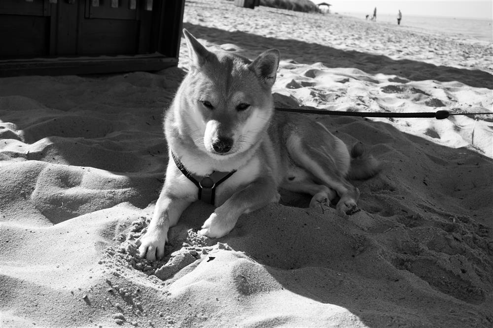
Look at the grayscale photo of the dog (below). Notice that the warmer sunlit sand is lighter than the cooler shaded sand, the dog's sunlit white fur is lighter than the shaded white fur, and the sunlit dark fur is lighter than the shaded dark fur. Looking at this grayscale photo, you can easily imagine that the dog is cooling off in the shade.
[CreativContent, Shutterstock.com]
[Syrtseva Tatiana, Shutterstock.com]
Look at the grayscale photo of the eggs (above). Notice that the warmer sunlit side of the eggs are lighter than the cooler shaded side, and the warmer sunlit side of the hand is lighter than the shaded side of the hand. Looking at this grayscale photo, you can easily imagine feeling the warmth of the sunlight on your hand.
Color photos. In the color photos below, you can see that the sunlit parts of most objects are lighter and have slightly warmer hues (more yellow, orange, or red), whereas the shaded parts of the same objects are darker and have slightly cooler hues (more cyan, blue, or violet). Each color photo is accompanied by a false-color version, in which I have crudely exaggerated the differences between the warm and cool hues. See my photo editing method below. You should not trust the accuracy of the colors in the photos as displayed on your screen or printed on paper. It is better to go outdoors and carefully observe the subtle color differences with your own eyes.
[CreativContent, Shutterstock.com]

Exaggerated warm-cool hue differences.
Examine the color photo of the dog (above). Notice that the warmer sunlit areas are lighter than the cooler shaded areas. Notice that the sand in the shadow is relatively more blue, and the sunlit sand is relatively more pink. Notice that the sunlit parts of the dog's orange fur are relatively brighter orange, and the shaded parts are relatively more blue (in other words, more gray-orange or lower chroma, see the relative-chroma effect below). Notice that the sunlit parts of the dog's white fur are relatively brighter white, and the shaded parts are relatively more blue.
[Fotoluminate LLC, Shutterstock.com]
Exaggerated warm-cool hue differences.
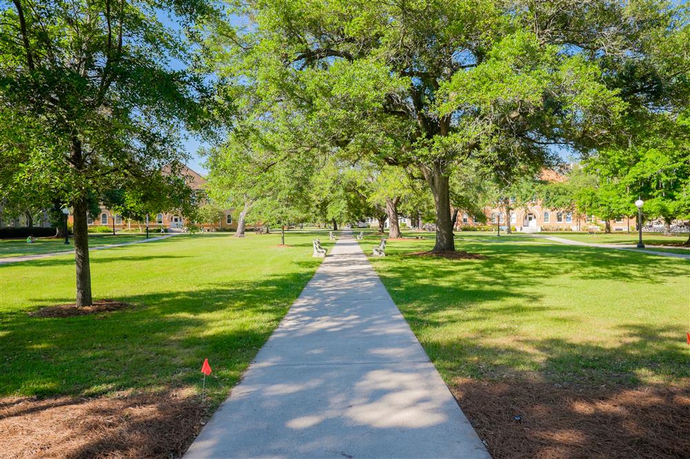
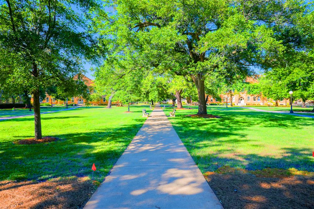
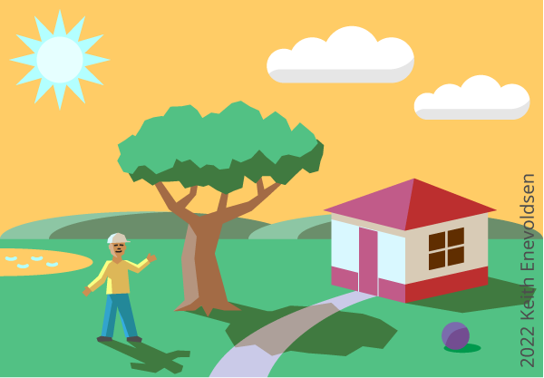
Examine the summer scene (above). Notice that the warmer sunlit areas are lighter than the cooler shaded areas. Notice that the sunlit parts of the walkway are relatively more pink, and the shaded parts are relatively more blue. Notice that the sunlit parts of the green grass and tree leaves are relatively more yellow-green, and the shaded parts are relatively more blue-green. Notice that the sunlit parts of the brown ground are relatively more orange, and the shaded parts are relatively more blue (in other words, more gray-brown or lower chroma).

[Ozkan Ulucam, Shutterstock.com]

Exaggerated warm-cool hue differences.
Examine the winter scene (above). Notice that the warmer sunlit areas are lighter than the cooler shaded areas. Notice that the sunlit parts of the white snow are relatively more pink or orange, and the shaded parts are relatively more blue. Although all the snow is cold to the touch, the sunlit snow is warmer (and will melt sooner) than the shaded snow. Notice that the shaded parts of the trees are relatively more blue-green, and the sunlit parts are relatively more yellow-green. Notice that the brighter front wall of the central cabin is relatively more pink or orange, and the shadier side wall is relatively more blue.

[BearFotos, Shutterstock.com]

Exaggerated warm-cool hue differences.
Examine the photo of children playing (above). Notice that the warmer sunlit areas are lighter than the cooler shaded areas. Notice that the sunlit grass is relatively more yellow-green and the (small) shadows in the grass are relatively more blue-green. Notice the many different colors of clothing, and that the shaded parts of each piece of clothing are usually relatively more blue than the sunlit parts of the same piece of clothing. Notice that the sunlit parts of the faces, arms, and legs are relatively more red or orange, and the shaded parts are relatively more blue (in other words, more gray-orange or lower chroma).

[Tatyana Soares, Shutterstock.com]

Exaggerated warm-cool hue differences.
Examine the photo of the woman and child reading on the sunlit couch (above). This is indoors, but near a window with direct sunlight and some skylight. Notice that the warmer sunlit areas are lighter than the cooler shaded areas. Notice that the shadows cast on the couch are relatively more blue. Notice that the sunlit parts of the faces, arms, and legs are relatively more pink or orange, and the shaded parts are relatively more blue (in other words, more gray-orange or lower chroma).
Paintings of scenes in sunlight and shade
Light and shade in paintings. Many painters faithfully reproduce the subtle colors they see in light and shade.
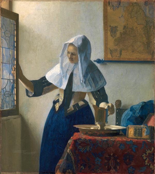
[Metropolitan Museum of Art, Public Domain]

Exaggerated warm-cool hue differences.
This indoor scene by Vermeer is illuminated by daylight from several large windows. (Vermeer's Delft studio windows faced northwest, so the windows had direct sunlight at some times, but only skylight at other times.) This indoor scene shows warm-cool color differences similar to an outdoor scene. Notice that the shaded part of the white head covering is relatively blue. Notice that the part of the wall near the windows is relatively more pink, orange, or yellow, and the farther part is relatively more blue. Notice that the lit part of the red table cover is relatively more red, and the shaded part is relatively more blue (in other words, more gray-red or lower chroma).
Color temperature effects of lightness, hue, and chroma
Lightness, hue, and chroma affect our perception of color temperature. Previously, we observed the relative-lightness correlation and the relative-hue correlation. I think that these observed correlations cause our mental association of color with thermal temperature. In this section, I will describe the effects of lightness, hue, and chroma on color temperature more systematically, and illustrate the effects with color circles and slices of color space. Here is my summary of the effects, as I see them:
Color temperature effects of lightness, hue, and chroma.
- Relative-lightness effect. Lighter colors are warmer. Darker colors are cooler. (Look at sunlight and shade.)
- Relative-hue effect. Hues nearer to the orange hues (yellow-orange to red-orange) are warmer. Hues nearer to the blue hues (green-blue to violet-blue) are cooler.
- Relative-chroma effect. For colors with orange hues (yellow-orange to red-orange), lower chroma is cooler. For colors with blue hues (green-blue to violet-blue), lower chroma is warmer.
Relative-lightness effect on color temperature. Lighter colors are warmer, and darker colors cooler. We observe this for objects of all colors (see the grayscale photos and color photos above). Lightness is the primary factor in determining relative warmth or coolness, at least when viewing objects in sunlight and shade. I think that the root reason for this effect is that the warm sunlight is relatively bright, and the cool shade is relatively dark (see the relative-lightness correlation above).
Note: The opposite proposition, that darker colors look warmer than lighter colors due to thermal absorption and reflection, is a plausible argument, but I refute it (see thermal absorption and reflection below).
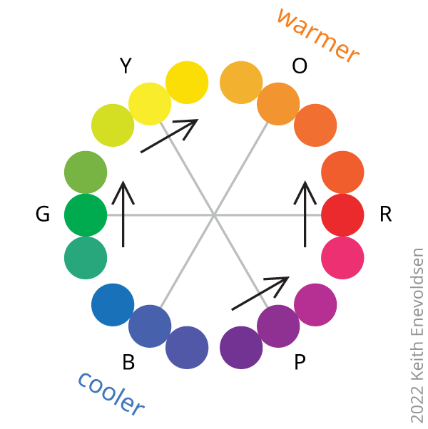
Relative-hue effect on color temperature. We observed that hues relatively nearer to red, orange, and yellow are warmer and hues relatively nearer to violet, blue, and green are cooler (see the relative-hue correlation and photos above). Can we determine the precise warmest and coolest hues, or can we at least narrow down the ranges of the warmest and coolest hues? Is there a consensus among artists?
Most artists agree (and I also agree) with the following warmer-cooler hue comparisons:
- Reds: Orange-red is warmer, and violet-red is cooler.
- Yellows: Orange-yellow is warmer, and green-yellow is cooler.
- Greens: Yellow-green is warmer, and blue-green is cooler.
- Purples or violets: Red-violet is warmer, and blue-violet is cooler.
However, artists are less likely to agree (and I am also ambivalent) about the following warmer-cooler hue comparisons:
- Oranges: Some say red-orange is warmer, and yellow-orange is cooler. Some say the opposite. Some say neither.
- Blues: Some say green-blue is cooler, and violet-blue is warmer. Some say the opposite. Some say neither.
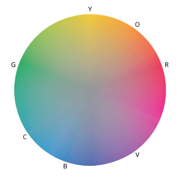
In summary, hues nearer to the yellow-orange to red-orange range are warmer, and hues nearer to the green-blue to violet-blue range are cooler. The warmer-cooler hue relationships are shown in the diagrams below.
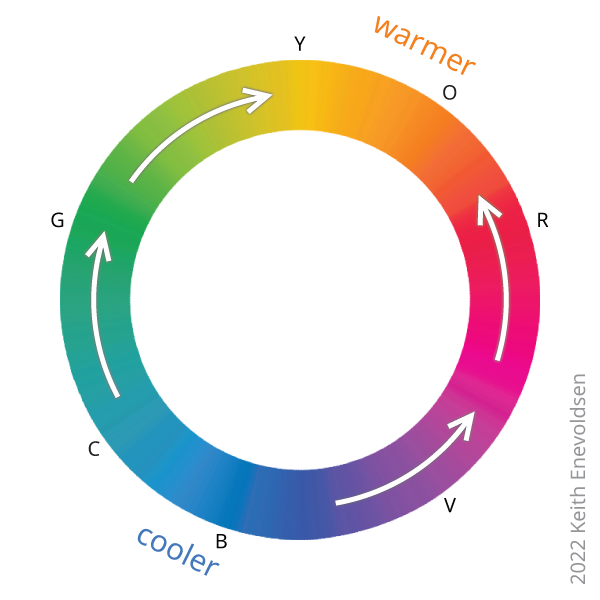
I think that the root reason for the relative-hue effect is that the warm direct sunlight has relatively more yellow, orange, and red hues, and the skylight illuminating the cool shade has relatively more cyan, blue, and violet hues (see the relative-hue correlation above).
There is no particular warmest hue in the yellow-orange to red-orange range, and no particular coolest hue in the green-blue to blue-violet range. Why? I think that the reason is this: If you start in a region of color space near the orange hues or the blue hues, and you want to step toward a warmer or cooler color, changing the hue has little effect, less effect than changing the chroma (see the relative-chroma effect below).
The warm hues (yellow-orange to red-orange) and cool hues (green-blue to blue-violet) are roughly complementary, on opposite sides of the color wheel. My simple sketches of color circles show them to be exactly complementary, symmetrically opposite, but there is no reason that they must be exactly complementary on any particular color circle.
Who can see warmer and cooler hues? I think that the relative-hue effect on color temperature should be visible to almost all sighted people, despite differences in their color vision. Most people with color vision deficiencies can distinguish warm yellow and orange hues, as in sunlight around sunset, from cool blue and cyan hues, as in skylight. Blue-yellow color deficiency is much rarer than red-green color deficiency.
Dominance of lightness over hue. The lightness effect on color temperature is much stronger than the hue effect. When the two effects are in opposition, lightness usually wins (see the lightness-versus-hue visual test below). To understand why, consider this: warm sunlight is very bright, but only slightly yellow or orange, and cool shade is much darker, but only slightly blue.
Are yellow and orange warmer than blue and violet because they are lighter? High-chroma yellow and orange are lighter than high-chroma blue and violet. Is our perception that yellow and orange are warmer than blue and violet caused mostly by their difference in lightness rather than their difference in hue? In other words, is the hue effect caused mostly by the lightness effect? This is plausible, given the dominance of lightness over hue. But I think that at least part of the hue effect is really due to hue, not lightness, based on visual comparisons of different hues at the same lightness (see the lightness-versus-hue visual test below).
Relative-hue and chroma effects for whites and grays. Most artists agree (and I also agree) that whites and grays with a red, orange, or yellow tint are warmer, and whites and grays with a violet, blue, or green tint are cooler, when comparing colors of the same lightness. A tinted white or gray, warm or cool, has a higher chroma than a neutral white or gray, because neutral colors have no chroma.
Relative-chroma effect on color temperature. High-chroma colors are vivid colors, and low-chroma colors are more gray. Painters reduce the chroma of a color by mixing in a complementary color, a hue on the opposite side of a hue circle. Similarly, illuminating a colored object with light of a complementary hue reduces the perceived chroma, making it more gray. Illuminating a blue object with slightly orange light reduces the chroma of the blue, and illuminating an orange object with slightly blue light reduces the chroma of the orange. For a color with a warmer orange hue (yellow-orange to red-orange), lowering the chroma moves it toward the complimentary blue hues, making it cooler. For a color with a cooler blue hue (green-blue to violet-blue), lowering the chroma moves it toward the complimentary orange hues, making it warmer. For a neutral white or gray, raising the chroma toward the red, orange, or yellow hues makes it warmer, and increasing the chroma toward the cooler green, blue, or violet hues makes it cooler.
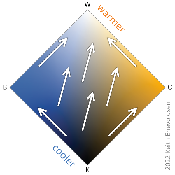
The warmer-cooler hue and chroma relationships are shown in the diagrams below. The disc-shaped slice of color space (below) has vivid hues on the rim and chroma decreasing toward the gray center. The arrows point away from blue hues and toward orange hues. The arrows cut through the lower-chroma middle region of the slice.


You can see from the diagrams above that, for the orange hues (yellow-orange to red-orange) and blue hues (green-blue to violet-blue), chroma affects color temperature more than hue does, but for other hues, hue affects color temperature more than chroma does.
Combined lightness, hue, and chroma effects on color temperature. The diamond-shaped slice of color space (below) shows all lightness values and all chromas for two complementary hues, a blue and an orange. The arrows point from cooler to warmer colors. The primary factor is that lighter colors are warmer than darker colors, and the secondary factor is that orange hues are warmer than blue hues. The arrows point primarily from darker to lighter colors, with a small slant away from blue hues and toward orange hues. The arrows cut through the lower-chroma middle region of the slice.
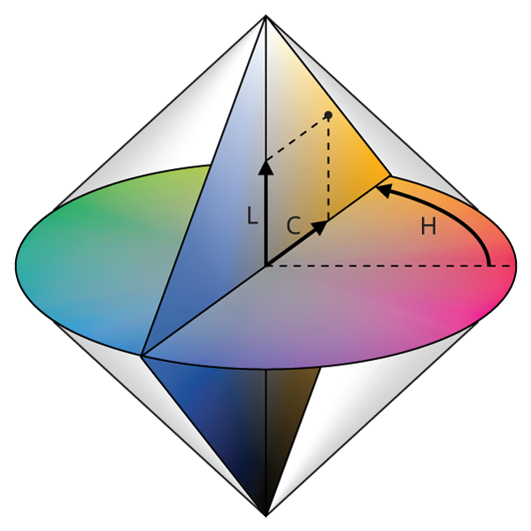
Color solid (bicone). Every color can be described as a point in a 3D color space (see color spaces below). I will use a simple color solid, a bicone, based on lightness, hue, and chroma. The bicone is merely a crude approximation of a realistic color solid.
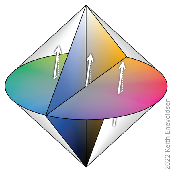
Combined lightness, hue, and chroma effects in color space. The sketch (above) of a 3D color solid (bicone) with arrows pointing from cooler to warmer colors shows the combined effects of lightness, hue, and chroma. The primary factor is that lighter colors are warmer than darker colors, and the secondary factor is that orange hues are warmer than blue hues. The cooler-to-warmer arrows point primarily from darker to lighter colors, with a small slant away from blue hues and toward orange hues. The arrows cut through the lower-chroma middle region of the solid.
Warmest and coolest colors. If I were required to pick the warmest and coolest colors, taking into account lightness, hue, and chroma, I would say the warmest colors are orange-whites, and the coolest colors are blue-blacks.
Alternative worlds: A thought experiment
Alternative worlds. On Earth, our sky looks blue, and our sun looks yellow-white and sometimes yellow-orange or orange. These colors are caused by Earth's atmosphere scattering violet, blue, and cyan more than red, orange, and yellow. Imagine another planet, Alterus, orbiting the same sun or an identical sun. Alterus is a twin of Earth in every way, but the sky looks yellow-orange, and the sun looks blue-white. These colors are caused by Alterus's atmosphere somehow scattering red, orange, and yellow more than violet, blue, and cyan. On Alterus, outdoors in sunlight, the warmer sunlit parts of most objects will appear lighter (as on Earth) and slightly more blue (not as on Earth), and the cooler shaded parts of the same objects will appear darker (as on Earth) and slightly more orange or yellow (not as on Earth).

Imagine that Alterus was long ago colonized by humans. The Alterians are biologically human. Alterians are born, raised, and live their entire lives on Alterus, and have done so for generations. The atmosphere is breathable, so the Alterians work and play outdoors without space suits. They feel the warmth of the sun and the coolness of the shade. Furthermore, Alterian culture is distinct from Earthian culture, so all their pictures, movies, and stories are from Alterus, not imported from Earth.
The key question is: Will the people who are born and raised on Alterus perceive blue as a warm hue and orange as a cool hue (when the two colors have the same lightness)? Yes, I think so! If not, then my theory of the human perception of warm and cool hues is wrong.
Appendix: Color spaces
Color spaces. Colors can be described as points in a 3D color space based on three coordinates, such as lightness (value), hue, and chroma. Realistic color spaces are based on experiments that measure human perceptions of colors. These include the Munsell system (1943), a uniform color space; CIELAB (1976), a uniform color space; and CIECAM02 (2002), a color appearance model. My sketches of color space have the coordinates lightness (value), hue, and chroma very roughly like the Munsell color system. My sketches have hue angles that are copied from the CIECAM02 hue angles, which are similar to the Munsell hue angles.
Color solids. Within a color space, all visible colors form a 3D color solid. Realistic color solids are asymmetrical (lopsided), but I use a simple symmetrical bicone. Other simple symmetrical color solids are the cube, cylinder, sphere, and cone. Simple symmetrical color solids are not very realistic, but they are easy to visualize, and they are useful as an aid to thinking about colors. A major flaw with the bicone is that it incorrectly shows all high-chroma colors at the same lightness, whereas the more realistic and asymmetrical color solids (like Munsell) show that high-chroma yellow and orange are lighter than high-chroma blue and violet.
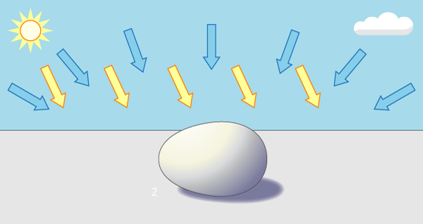
Appendix: Sunlight-versus-skylight experiment
Simple experiment to compare the brightness of sunlight and skylight. When the sun is shining, the sun is brighter than the entire blue sky (see sunlight and skylight above). If this is not clear to you, you can prove it with a simple experiment. On a sunny or partly cloudy day, not overcast, go into an open area that is exposed to the whole sky, like a treeless field or parking lot. Shade one patch of ground with an elevated piece of cardboard. This patch of ground is shielded from direct sunlight but exposed to skylight on all sides. Cover a similar patch of ground with a cardboard box with a hole for sunlight and a hole for viewing, as shown in the diagram. This patch of ground is exposed to direct sunlight but shielded from skylight on all sides. Observe that the sunlit patch is brighter than the skylit patch.

Appendix: Lightness-versus-hue visual test
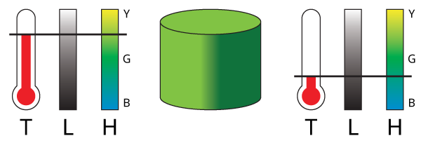
Visual test to compare the effects of lightness and hue. We described two color temperature effects: the relative-lightness effect and the relative-hue effect. I think that the lightness effect is much stronger than the hue effect. To verify this, take this visual test. Look at the diagram below with the four green cylinders. For each object, you decide which side appears warmer (or sunlit) and which side appears cooler (or shaded).
Note: This visual test is useless if your copy of the image does not reproduce the intended colors.

Object 1. The left side is light yellow-green, and the right side is dark blue-green, so the lightness and hue effects are in agreement. To me, the left side appears to be lit by golden light (perhaps sunlight) and warmer, and the right side clearly appears to be shaded and cooler.
Object 2. The left side is light, and the right side is dark, but both sides have the same medium green hue. To me, the left side appears to be lit by white light (perhaps sunlight) and warmer, and the right side clearly appears to be shaded and cooler. This indicates that lightness alone strongly influences color temperature.
Object 3. The left side is yellow-green, and the right side is blue-green, but both sides have the same lightness. To me, the left side appears to be slightly warmer than the right side, but neither side appears to be more lit or more shaded. This indicates that hue alone only slightly influences color temperature.
Object 4. The left side is light blue-green, and the right side is dark yellow-green, so the lightness and hue effects are in opposition. To me, the left side appears lit by bluish light (perhaps skylight) and slightly warmer, and the right side clearly appears to be shaded and cooler. This indicates that lightness dominates over hue in the determination of color temperature.
Appendix: Thermal absorption and reflection

Do darker colors appear to be warmer than lighter colors because of thermal absorption and reflection? People perceive lighter colors to be warmer than darker colors, at least when looking at the sunlit and shaded parts of objects. But the physics of thermal absorption and reflection points to the opposite conclusion that darker colors are warmer than lighter colors. Darker colors absorb more light and heat, and lighter colors reflect more light and heat. For example, on a sunny day, white clothing feels cooler than black clothing, and black asphalt pavement feels warmer than white concrete pavement. It is a common experience to wear light or dark clothing on a sunny day, so it could plausibly cause people to perceive darker colors as warmer than lighter colors. However, it is also a common experience to perceive that the sunlit parts of clothing (of any color) are both warmer and lighter than the shaded parts of the same clothing, plausibly causing the opposite perception. I think that our perceptions are more strongly influenced by our more numerous (countless) experiences of seeing objects with warmer sunlit parts and cooler shaded parts, than our less numerous (yet common) experiences of comparing darker heat-absorbing objects to lighter heat-reflecting objects.
Appendix: Thermal radiation
Is blue warmer than red because of thermal radiation? People perceive red to be warmer than blue. But the physics of thermal electromagnetic radiation (also called black-body radiation) points to the opposite conclusion that blue is hotter than red. Objects at lower temperatures thermally emit more longer wavelengths (more red or infrared), and objects at higher temperatures thermally emit more shorter wavelengths (more blue, violet, or ultraviolet). Glowing-hot objects (such as red-hot embers and white-hot lamp filaments) thermally emit visible light. Blue-hot bodies are hotter than red-hot bodies. Cooler bodies (such as rocks, plants, and animals) thermally emit invisible infrared light.
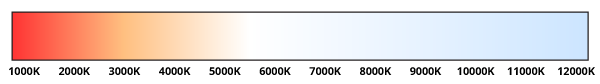
But the colors of thermal radiation have little bearing on our human perceptions of warm and cool colors. We cannot even see the infrared thermal radiation from most objects in our experience. We perceive all glowing-hot objects as very hot, regardless of whether they are red-hot, white-hot, or blue-hot. Although our visual experience is dominated by one thermally radiating object, our white-hot sun, still our perception of color temperature does not correlate to thermal radiation temperature. We have only one sun, so we do not have any experience comparing our white sun to a cooler red sun or a hotter blue sun. Our perception of color temperature actually goes opposite to the thermal radiation temperature, as you can see when you are shopping for lights: warm-white lights have a lower color temperature (K) than cool-white lights.
Is blue warmer than red because of the wavelength or frequency? Blue light has a shorter wavelength and higher frequency than red light, so it has more energy per photon, so it can generate more heat per photon. This purely physical argument has no bearing on our human perceptions of warm and cool colors because we do not see individual photons.
Appendix: Photo editing method
Photo editing to exaggerate colors. To make the exaggerated-color photos above, I used a photo editor (Photoshop) to crudely exaggerate the differences between the warm and cool hues within each object. First, I selected all parts of an object or group of objects having a single object color, such as a green lawn, a concrete sidewalk, a pink dress, or a person's face, being sure to select both sunlit and shaded parts of the object together. Second, I normalized the hues toward a more neutral average by shifting the hue balance of the entire selection, both sunlit and shaded parts together, until at least some parts of the object had red, orange, or yellow hues, and some other parts had cyan, blue, or violet hues. For example, say that an area of brown earth has parts with a higher chroma (orange-brown) and parts with lower chroma (gray-brown). Then, rebalancing to make the average hue more neutral will shift the orange-brown toward medium-brown, and the gray-brown toward blue-gray. Finally, after rebalancing the hues of all the objects, I increased the saturation of the entire photo to make the hue differences more apparent. This process of rebalancing hues shows that, typically, the sunlit parts of an object are relatively more yellow, orange, or red, and the shaded parts are relatively more cyan, blue, or violet.
You should not trust the accuracy of the colors in the photos as displayed on your screen or printed on paper. It is better to go outdoors and carefully observe the subtle color differences with your own eyes.
References
Disclaimer: I am an amateur, not an expert. My theory of color temperature is based on my own observations and my reading about color theory.
To learn more in detail about color temperature from an expert, I recommend this resource: Bruce MacEvoy's color temperature, under color theory, at handprint.com. Note: My amateur theory partly agrees and partly disagrees with MacEvoy's expert theory.